
Saturday, December 10, 2011
Monkeyball

Thursday, June 2, 2011
Hey bub...
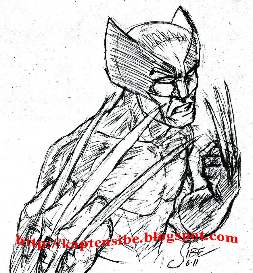
Anyway, the claws should be longer here though and the anatomy's a little iffy but hey, it's just a quick sketch for fun so I'm not gonna bother. Not to mention that the pencils were so light it was hard getting a good scan without turning the contrast way the hell up, which means you can see every stray line and every speck of dirt too. Oh well.
Wednesday, June 1, 2011
PhilosoFish
I drew this a while ago. This is kind of where my head's been at lately.
It could be that there are three kinds of people in the world. There are those who just pick a destination and head for it, then the rest of the world seems to align around them. There are those who find joy in modest goals, who go to work every day and come home every evening and they are satisfied with that. Then there are those like me, like the fish in that picture, who dare to dream big but are too well aware of their own limitations to achieve it. I dunno.
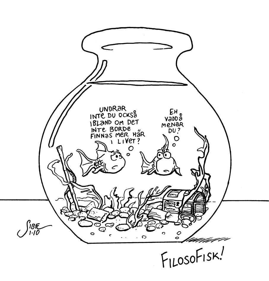 |
| "Don't you wonder sometimes if there shouldn't be more to life than this?" "Um whattaya mean?" |
It could be that there are three kinds of people in the world. There are those who just pick a destination and head for it, then the rest of the world seems to align around them. There are those who find joy in modest goals, who go to work every day and come home every evening and they are satisfied with that. Then there are those like me, like the fish in that picture, who dare to dream big but are too well aware of their own limitations to achieve it. I dunno.
Saturday, May 7, 2011
Saturday, April 30, 2011
Monday, January 3, 2011
New resolutions

I've decided to let doubt be a thing I leave behind in 2010. If and when I draw, it's going to be because I want to. 2011 is going to be the year I take my artwork to new places, creatively and even geographically. On the other hand, if I do decide to quit drawing, I'll find a new pursuit and I won't look back. Whatever I decide to do, I will do it wholeheartedly. I'm barrelling full speed ahead towards an unknown goal, and I quite like it.
Sunday, January 2, 2011
113
Friday, November 12, 2010
112

Thursday, November 11, 2010
111

Having said that, I wouldn't mind drawing a blaxploitation graphic novel some day. A good one.
Wednesday, November 10, 2010
110

(click to embiggify)
I guess this deserves an explanation. Looker vs. Solarr?!? These characters are obscure by anyone's standards, so what's going on here?
Back in the 1980s, Marvel and DC Comics both published these encyclopedia-style series about their respective characters, The Official Handbook of the Marvel Universe and Who's Who in the DC Universe. One day last month, I knew I would have some time to kill after work, so I had this wild idea. Since it was October 13, I brought Marvel Universe #10 (for October) and Who's Who #13 (for the 13th) with me. Without telling them why, I asked two of my friends to pick a number between 1 and 32 (the number of pages in the books, natch). My pal Ida A. picked 17, which was Solarr (Marvel), and my pal Sophia J. picked 28, which was Looker (DC).
The rules I set for myself was that the whole thing had to be done that evening, meaning I had somewhere between 1 to 1 1/2 hours to do it and both characters should be properly identifiable, i.e. neither one should have his/her back to the camera.
Looker was surprisingly fun to draw, and Solarr was unsurprisingly... not. I've held onto this for almost a month now, thinking about whether or not I should spruce this up before posting it online... ink it... fix the somewhat iffy anatomy... draw a background, maybe? But ultimately, it's not worth it. I post it now because I decided to put it behind me. So here it is, warts and all.
Wednesday, October 13, 2010
109

Saturday, October 9, 2010
Review: The Nobody
One day, in a rural fishing village where nothing much usually happens, a drifter covered in bandages walks into town. He rents a room at the local inn, while the other residents of Large Mouth keep a suspicious eye on him. There's a rumor that the he's a wanted man - or maybe a victim of a horrible accident. Only the stranger himself knows the truth, and he's not telling anyone. This is the story of The Nobody.
 The Nobody is written and drawn by Jeff Lemire, relatively new to the graphic novel scene. Prior to this, he produced the Essex County Trilogy, which was published by Top Shelf Productions and nominated for both a Harvey Award and two Eisner Awards (very prestigous comics awards, for those of you who don't know). The Nobody was published last year by Vertigo, who also publish his current ongoing series, Sweet Tooth.

Saturday, October 2, 2010
Review: Crossed
Crossed is a graphic novel set in a post-apocalyptic world, where a mysterious plague causes its victims to pursue their foulest desires - like rape, murder and cannibalism (and not necessarily in that order). Carriers of the virus are known as The Crossed due to a cross-like rash that appears on their faces. The story follows a group of survivors on the way to Alaska, where they hope they'll be relatively safe.
 Crossed is written by Garth Ennis, who you may be familiar with from Preacher, The Punisher and The Boys. Many of Ennis' usual themes show up here, mostly bodily mutilation and sexual depravity, occasionally tempered with dark humor. We also see moments of male friendship and criticism of religion, which is par for the course with Ennis. Crossed is certainly not his best work, but probably his darkest and most unrestrained. The artist, Jacen Burrows, I admit I'm less familiar with. He has worked on various series for Avatar Press, perhaps most notably Alan Moore's The Courtyard. Burrows' style can be compared to another of Ennis' frequent collaborators, Steve Dillon. It is clear, competent storytelling, but not very dynamic. Burrows draws meticulous backgrounds, though.

Friday, September 24, 2010
Pinin' for the fjords?!?
Hey there. I just noticed today that Blogspot has a statistics feature now. I can keep track of how many hits per day I get, and what search terms have brought me visitors, that kind of thing. I've missed this function ever since I started this blog, and it surprised me a bit that there wasn't even a "new function" blurb or anything to make me aware of it. I'm reasonably sure I'm not dense enough to just not notice this for three years, so I guess it's brand new.
So that is partly why I'm writing this... I found out that I have a lot more readers than I thought! Therefore, I just thought I'd drop a quick note about what's going on. For those of you visiting more or less frequently, I haven't abandoned this blog. Life has been pulling me in about two dozen different directions lately, and blogging has been low on my list of priorities. But this blog is not dead, it's just resting. It's "pining for the fjords," to quote Monty Python.
Hopefully, I'll get my life in working order again soon, and post some new artwork up here. From what I can tell, the "Artists I Like" articles and the Scott Pilgrim review seem to be pretty popular posts, so there's going to be more of that kind of thing too.
So thank you for stopping by, dear readers! Your continuing patronage means a lot to me, so drive safely and please come back soon!
So that is partly why I'm writing this... I found out that I have a lot more readers than I thought! Therefore, I just thought I'd drop a quick note about what's going on. For those of you visiting more or less frequently, I haven't abandoned this blog. Life has been pulling me in about two dozen different directions lately, and blogging has been low on my list of priorities. But this blog is not dead, it's just resting. It's "pining for the fjords," to quote Monty Python.
Hopefully, I'll get my life in working order again soon, and post some new artwork up here. From what I can tell, the "Artists I Like" articles and the Scott Pilgrim review seem to be pretty popular posts, so there's going to be more of that kind of thing too.
So thank you for stopping by, dear readers! Your continuing patronage means a lot to me, so drive safely and please come back soon!
Monday, August 16, 2010
Artists I Like: Mike Parobeck
.jpg) Michael J. Parobeck was born in Ohio in 1965, and educated at the Central Academy of Commercial Art in Cincinnati. He began his comics career in 1987, debuting in a charity comic called Quest For Dreams Lost. In 1989, he started picking up work for DC Comics, for example short stories in Secret Origins. His first ongoing assignment was El Diablo, followed by The Fly, Justice Society of America and Elongated Man. However, his most popular work would be a three-year run on Batman Adventures, a Batman title based on the animated TV series. Midway during his Batman run, he was diagnosed as having Type 1 diabetes, while also dealing with severe childhood trauma. As a result, he had a hard time with his new medical disorder, instead burying himself deeper into his work and neglecting his insulin injections. He died from complications resulting from his diabetes in July 1996, only 30 years old.
Michael J. Parobeck was born in Ohio in 1965, and educated at the Central Academy of Commercial Art in Cincinnati. He began his comics career in 1987, debuting in a charity comic called Quest For Dreams Lost. In 1989, he started picking up work for DC Comics, for example short stories in Secret Origins. His first ongoing assignment was El Diablo, followed by The Fly, Justice Society of America and Elongated Man. However, his most popular work would be a three-year run on Batman Adventures, a Batman title based on the animated TV series. Midway during his Batman run, he was diagnosed as having Type 1 diabetes, while also dealing with severe childhood trauma. As a result, he had a hard time with his new medical disorder, instead burying himself deeper into his work and neglecting his insulin injections. He died from complications resulting from his diabetes in July 1996, only 30 years old. Parobeck’s style was quite unlike a lot of the comic book art of the early 1990s, when the order of the day was beefy exaggerated anatomy and heavy cross-hatching. His fluid animation-inspired drawing style was always coupled with clear, clean layouts, great senses of design and drama, and accessible, attractive characters. You would often see characters with a wide smile on their faces and imagine they were drawn by someone who genuinely loved what he was doing.
  Among his influences are John Byrne (Parobeck referred to him as being “the reason that I got into this field at all.”), Jaime Hernandez and Alex Toth. And thanks to his distinctive style, Parobeck himself became an inspiration to others. Mike took the time to help other young artists (including David Mack) who he would correspond with letters of advice and encouragement.
 Unfortunately, not much of his work remains in print today, which is truly a shame. Batman: The Dark Knight Adventures collects the first six issues of his Batman Adventures run (and it’s a steal at $7.95), but that’s about it. For the rest of his body of work, you’ll have to hit the back issue bins and the online mail order companies. It’s well worth the effort, though.
Saturday, August 14, 2010
108

Drew this a couple of months ago. Originally, I wasn't even going to post this, for two reasons.
One, well, it's just not very good, is it? Kinda sloppy, 10-minute sketch. Meh.
Two, super-heroes are already over-represented in this blog. In the last few months, I've read and enjoyed stuff like The Walking Dead (zombie horror), Scott Pilgrim (romance/alternative), Persepolis (autobiography), The Rocketeer (pulp adventure) and From the Ashes (post-apocalyptic comedy), just to name a few. It's just that super-heroes lend themselves better to this kind of sketchblog. Sure, I could draw Scott Pilgrim, but unless it's drawn in Bryan Lee O'Malley's idiosyncratic style, it probably wouldn't even be recognizable as Scott Pilgrim. Likewise, it doesn't make sense for me to draw Marjane Satrapi (from Persepolis) since I'm not Marjane Satrapi. Hence: super-heroes. Recognizable entities that I can give my own interpretation to.
I guess what I'm really trying to say is, I read a lot of other things too.
Sometimes books without pictures, even.
One, well, it's just not very good, is it? Kinda sloppy, 10-minute sketch. Meh.
Two, super-heroes are already over-represented in this blog. In the last few months, I've read and enjoyed stuff like The Walking Dead (zombie horror), Scott Pilgrim (romance/alternative), Persepolis (autobiography), The Rocketeer (pulp adventure) and From the Ashes (post-apocalyptic comedy), just to name a few. It's just that super-heroes lend themselves better to this kind of sketchblog. Sure, I could draw Scott Pilgrim, but unless it's drawn in Bryan Lee O'Malley's idiosyncratic style, it probably wouldn't even be recognizable as Scott Pilgrim. Likewise, it doesn't make sense for me to draw Marjane Satrapi (from Persepolis) since I'm not Marjane Satrapi. Hence: super-heroes. Recognizable entities that I can give my own interpretation to.
I guess what I'm really trying to say is, I read a lot of other things too.
Sometimes books without pictures, even.
Wednesday, August 4, 2010
Review: Scott Pilgrim's Precious Little Life
I just finished re-reading Scott Pilgrim's Precious Little Life. It's the first part of a six-volume series of graphic novels by Bryan Lee O'Malley. I'm really psyched for Edgar Wright's upcoming movie adaptation, Scott Pilgrim vs. the World, so I thought I'd better read the books first. I've only read the first one before, but now I've managed to get the entire set and am really eager to get into the rest of it.
 The premise is basically this: Scott Pilgrim is a 23-year-old slacker who plays bass guitar in the band "Sex Bob-Omb." He meets and falls in love with delivery girl Ramona Flowers, but must defeat her seven "evil exes" in order to date her. Only the first one shows up in this book, though. Actually, here's the movie trailer, that explains the plot well enough. Go ahead, watch. I'll wait.
Sex Bob-Omb's music is described as "fast, hard, sloppy" and in a way, that also describes Bryan Lee O'Malley's art. It's rough and energetic and looks spontaneous, like he had fun drawing this. Unlike Sex Bob-Omb's music, however, O'Malley's art is not terrible. He manages to convey subtle emotions remarkably well in such seemingly simple artwork. The character of Scott Pilgrim is sort of a clueless dork, but a very endearing one (in other words, perfect casting for Michael Cera). The other characters are also very likable, and the dialogue is both funny and believable. The genius part is the mash-up of romance/comedy graphic novel and 1980s-style video game duel. While the genre change comes quite sudden, you can't help but feel it's awesome when (SPOILER!*) Scott whups the first evil ex and he implodes, dropping $2.10 in coins ("not even enough for the subway back home!" Scott complains). It's a really cool book, and I look forward to seeing what director Edgar Wright does with the movie version. You may remember him as the director of Shaun of the Dead and Hot Fuzz, so this could be a cult comedy hat trick.
And hey, you can even read the first 50 (!) pages for free at the official Scott Pilgrim website! How about that?
 Yeah, I thought so.
* Oh come on, this is not a spoiler. Of course he defeats the first evil ex; there wouldn't be six volumes if he lost, would it?
 The premise is basically this: Scott Pilgrim is a 23-year-old slacker who plays bass guitar in the band "Sex Bob-Omb." He meets and falls in love with delivery girl Ramona Flowers, but must defeat her seven "evil exes" in order to date her. Only the first one shows up in this book, though. Actually, here's the movie trailer, that explains the plot well enough. Go ahead, watch. I'll wait.
Sex Bob-Omb's music is described as "fast, hard, sloppy" and in a way, that also describes Bryan Lee O'Malley's art. It's rough and energetic and looks spontaneous, like he had fun drawing this. Unlike Sex Bob-Omb's music, however, O'Malley's art is not terrible. He manages to convey subtle emotions remarkably well in such seemingly simple artwork. The character of Scott Pilgrim is sort of a clueless dork, but a very endearing one (in other words, perfect casting for Michael Cera). The other characters are also very likable, and the dialogue is both funny and believable. The genius part is the mash-up of romance/comedy graphic novel and 1980s-style video game duel. While the genre change comes quite sudden, you can't help but feel it's awesome when (SPOILER!*) Scott whups the first evil ex and he implodes, dropping $2.10 in coins ("not even enough for the subway back home!" Scott complains). It's a really cool book, and I look forward to seeing what director Edgar Wright does with the movie version. You may remember him as the director of Shaun of the Dead and Hot Fuzz, so this could be a cult comedy hat trick.
And hey, you can even read the first 50 (!) pages for free at the official Scott Pilgrim website! How about that?
 Yeah, I thought so.
* Oh come on, this is not a spoiler. Of course he defeats the first evil ex; there wouldn't be six volumes if he lost, would it?
Monday, August 2, 2010
107

A friend of mine who is a photographer told me that a sub-par color photo will almost always look better in black & white. Presumably it looks more thought out and maybe even a little artsy. Interestingly enough, I find that for artwork, the opposite seems to hold true. Even a quick, silly sketch like this looks much more professional and finished with even the most basic of colors applied.
Sunday, August 1, 2010
106
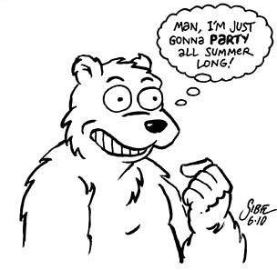
A few months ago, I had this idea for a comic strip about Bipolar Bear. The basic premise was that it was about a polar bear who had these insane mood swings, hence "bi-polar" bear (I love stupid puns). Anyway, I drew a couple of tryout sketches (like the one you see above). I should have posted this then, because it would have been more topical at the onset of summer, rather than early August. But I felt like I wanted to keep the character to myself for a while, to explore the possibilities of the concept. I even wrote about five pages of script for a Bipolar Bear story...
...but that's a story for another time.
Saturday, July 31, 2010
Minor update
As you may notice, I've added labels to all previous posts. When I started this blog, I didn't feel like it was really necessary, but with 100+ posts now, I needed some way to find anything specific I'm looking for, other than clicking through half a dozen pages. Also, I wasn't sure exactly what labels I wanted to use - general ones like "super-heroes" or "landscapes"; art-specific labels like "pencil sketch" or "inked sketch" or character-specific labels. I decided to go with the latter, making it very easy to find any given post. The downside to this is that you end up with an increasingly long list of labels. But I think I can live with that.
So, dear readers - any input? Labels I've missed, maybe?
So, dear readers - any input? Labels I've missed, maybe?
Subscribe to:
Posts (Atom)